Power BI Dashboards:
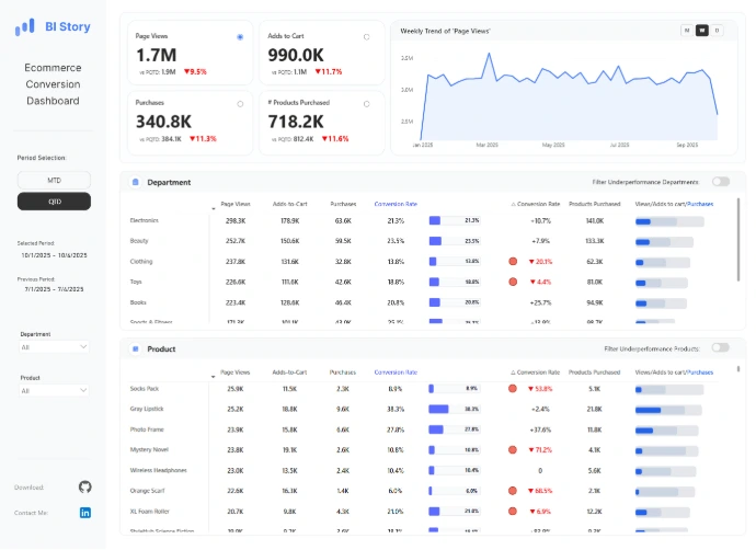
Ecommerce Conversion Dashboard
This dashboard analyzes the ecommerce conversion funnel from Page Views to Adds to Cart to Purchases.

IT-Support Performance Dashboard
A structured analysis of IT support operations across three key focus areas: 1. Ticket Volume & Classification 2. Efficiency & Resolution 3. Optimization & Service Improvement

Geo-Sales Dashboard Azure Map
Advanced functionalities of Azure Maps and HTML Content Custom Visual in Power BI. Enhanced Customization, Cluster Bubbles, 3D Column Layers, and other techniques applied to this dashboard.

Sales Performance Dashboard
The scenario was to create a dashboard for the CEO of the awesome chocolate company and provide performance insights.

Root Cause Analysis
A BI dashboards that empower users to go beyond surface-level reporting and truly understand the "why" behind their data. This Root Cause Analysis dashboard is designed to do just that with 𝗗𝗲𝗰𝗼𝗺𝗽𝗼𝘀𝗶𝘁𝗶𝗼𝗻 𝗧𝗿𝗲𝗲, 𝗙𝗶𝘀𝗵𝗯𝗼𝗻𝗲, and 𝗝𝗶𝘁𝘁𝗲𝗿 𝗣𝗹𝗼𝘁 visuals.

Agents Performance Dashboard
TopN/BottomN in one visual, a dashboard to help identify the highest lowest agents based on different metrics and KPIs.
Python Dashboards/Apps:

Discount Strategy Dashboard
A business intelligence dashboard built with Quarto and Shiny for Python that provides data-driven discount strategy recommendations through analysis of price elasticity, customer segments, regional performance, company goals and historical trends.

MTA Recovery Dashboard
Interactive dashboard tracking NYC public transit recovery post-COVID. Built with Python and Dash, it visualizes recovery rates, trends, and KPIs using MTA data. Features dynamic filtering, responsive design, and actionable insights for transit analytics.

Healthcare Analytics Dashboard
A Streamlit dashboard for hospital performance analysis, patient clustering, and billing optimization. This interactive dashboard analyzes 55,500+ patient records across 10 U.S. hospitals.

NYT Articles Dashboard
Interactive dashboard analyzing 15 years of New York Times articles (2010-2025). Built with Dash and Bootstrap.
Tableau Dashboards:
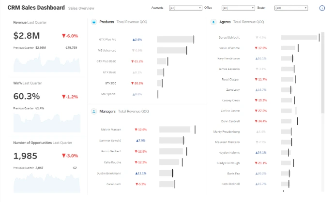
CRM Sales Dashboard
Quarter over quarter performance dashboard, focusing on the managers, agents and products sales. Different filters are available and they are based on customer information like office or sector.
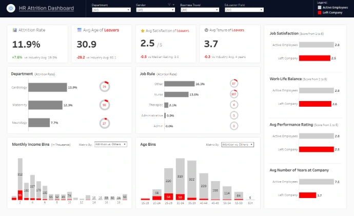
HR Attrition Dashboard
Tableau HR Attrition Dashboard showing employee attrition rate, average age, satisfaction, and tenure of employees who left, compared with active employees.

Executive Dashboard for Customer Conversion Insights
Data in Motion Travel Analytics, This dashboard provides a comprehensive view of customer conversion performance, and It helps identify the characteristics of customers most likely to convert.

Customer Churn Dashboard
Interactive dashboard tracking NYC public transit recovery post-COVID. Built with Python and Dash, it visualizes recovery rates, trends, and KPIs using MTA data. Features dynamic filtering, responsive design, and actionable insights for transit analytics.

The World's Highest-Paid Athletes
I designed this dashboard to better understand the distribution of the highestpaid athletes across different sports, and how much they earn both on the field and off the field.

How I Help Your Business
1- Understand your business & KBQs
I don’t start with charts, I start with questions.
2- Design decision-focused mockups
Reliable insights based on reliable data.
3- Model, automate & scale
Clear, intuitive, executive-ready.